What are swatches? #
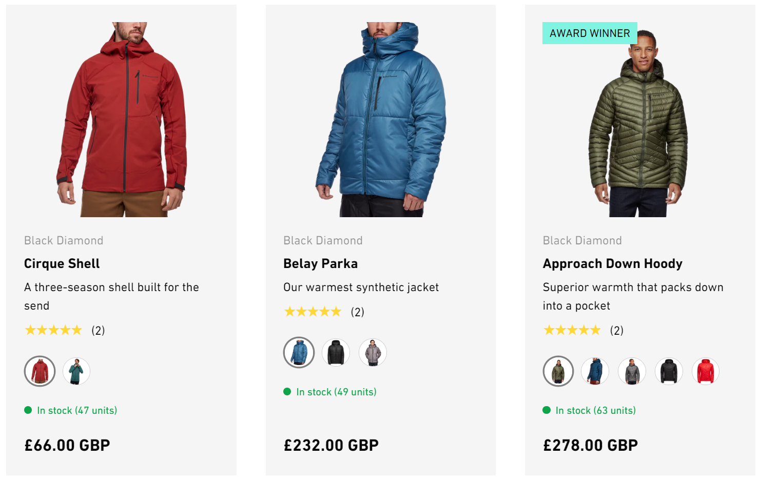
Swatches are small, but very useful visual indicators that display the colors, patterns and materials in which a product is available to customers.
Instead of displaying the options as plain text, swatches provide a more intuitive and engaging way for customers to interact with the available choices. To create swatches, you can either use Shopify’s native swatches, color hex codes, the variant’s image or upload your own custom swatch images. Different swatch styles can be used in different places in the store to provide for greater flexibility, for example variant images on the product page and plain colors on the product card or filters.
How to set up swatches #
Steps
- Open the Theme Editor, and click on Theme Settings > Swatches.
- Within the Color option name setting, enter the variant option title (e.g. Color).
- Set the preferred swatch Style for Variant pickers. The swatch Style for variant pickers can be Shopify, Text, Swatch color list or Variant images.
- Choose the Icon shape (circle, natural, portrait or square) and Icon size which will be used for Button style variant pickers. Icons are always used for Variant image style swatches and Shopify style swatches. Color list swatches can show in dropdowns.
- Set the preferred swatch Style for Product cards. Choose from Shopify, Text, Swatch color list, Variant images or None.
- Choose the Icon shape and Icon size for the swatch in product cards.
- Set the preferred swatch Style for Product filters used on the collection and search pages. Choose Shopify, Swatch color list or None.
Swatch style – Shopify #
Shopify native swatches work using category metafields. When creating or editing a product it is possible to link a variant option to a color metafield. Shopify have a category metafield guide which explains how to set this up. Set the swatch Style to be Shopify to choose this swatch method. These swatches can appear in variant pickers, product cards and filters.
Swatch style – Color list #
The Swatch color list swatch style can be used in collection and search page filters as well as in product cards and the product page. It is flexible and can support single or multiple colors and image files. When using swatch colors, it’s necessary to tell the theme what to show for each color by filling in the Swatch color list box.
Steps
- Open the Theme Editor, and click on Theme Settings > Swatches.
- Within the Color option name setting, enter the variant option title (e.g. Color)
- Within the Swatch colors setting, enter the color followed by : (a colon) followed by either a hex color code or an image file name. Each color should be on a separate line:
- For plain swatches – Enter the hex color code which should start with a # (Example Red:#ff0000 Green:#008000 Blue:#0000ff).
- For striped swatches – Enter multiple color codes per line. (Example Red & White:#ff0000#fff).
- For custom image file swatches – Enter the color then the name of the file (Example Blue:blue.png) The image files should be uploaded in the Shopify admin in Content > Files. For best results use png image files of a consistent shape and size.
- Choose Swatch color list as the swatch style for Variant picker, Product cards or Product filters.


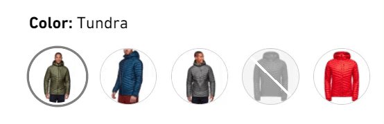
Swatch style – Variant image #
Variant image swatches can be used in variant pickers and in product cards. When product variants are already linked to different variant images it is very quick to set up. This type of swatch isn’t used in filtering on the collection and search pages.
Steps
- Open the Theme Editor, and click on Theme Settings > Swatches.
- Choose Variant image as the swatch style for Variant pickers or Product cards.
- Set the Icon shape and Icon size.
Note
To ensure that images are displayed for your product variants, it is important to add Variant images. Without them, no images will be displayed. The theme cannot anticipate which specific images you intend to display.
Swatch style – Text
The text option can be used in variant pickers to show the name of the color or on product cards to indicate how many colors are available.
Steps
- Open the Theme Editor, and click on Theme Settings > Swatches.
- Within the Color option name setting, enter the variant option title (e.g. Color).
- Choose Text as the swatch Style for Variant pickers or Product cards. To show text in filters set the filter swatch style to be None.


